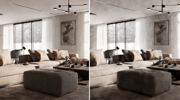
One of the key points to get a good performance in Cycles is to understand how path tracing works. When you get to realize that in some scenes, you have to add some extra lights or use, portals things will evolve quickly to a final solution.
From a space point of view, path tracing “doesn't like much” small light sources and confined spaces. If a scene doesn't have big windows or spaces to let light go in and out, you probably will face a lot of noise.
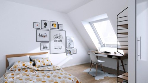
That is not the case with a project named Attic Workspace from artist krsblend, which appeared in the Blenderartists forums. There you will be able to get all renders from this project.

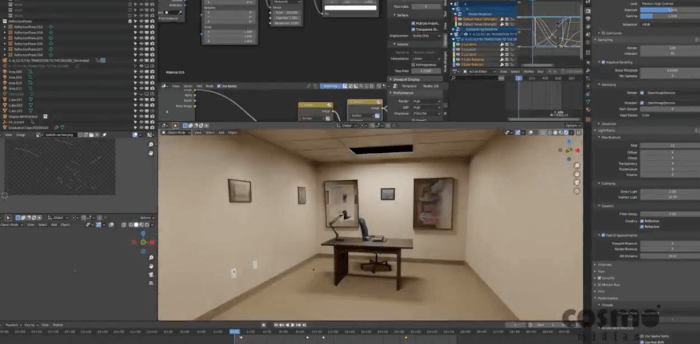
Despite being a great collection of clean renders, you also get to look how the artist solved all lights and settings in Cycles. Yes, all settings for lights and color management are available there. Just follow the link to the thread and look at the screenshots with all settings.
If you are having trouble with the light settings for Cycles and your scene looks like this Attic, maybe studying those settings will give you some insights to solve a similar light setup.


