
In the last few months, you probably heard about the qualities and groundbreaking tools offered by Blender 2.8. That is true, and if you tried to use the new user interface and options such as Eevee for real-time rendering, you would see how those statements reflect the truth.
The new release cycle of Blender will bring version 2.90 around July or August of 2020. Because of that, we won’t see versions 2.84–2.89 and will jump straight from 2.83 to 2.90.
With version 2.90, you will find the same user interface of 2.8x with some “cosmetic” changes, which is great because there won’t be any drastic redesign forcing artists to learn everything from scratch.
In version 2.90, you will find a “game-changer” tool for architectural modeling. The new tool has the name of Extrude, Dissolve, and Intersect. Because of that tool, we are assigning a cute nickname to version 2.90: The SketchUp killer.
What can we do with the Extrude, Dissolve, and Intersect? Here is a quick demo of the tool:
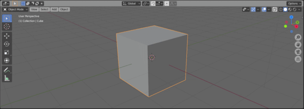
As you can see from the video, it can extrude and change a model topology by dissolving faces (N-Gons) and also intersect the results with surrounding faces. It works in a very similar way of the Push/Pull from SketchUp.
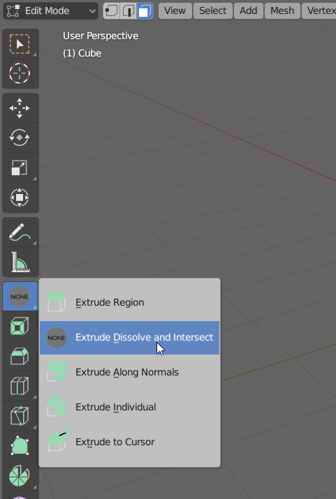
(We still don't have an icon for the tool)
If you have any prior experience trying to teach Blender for architects, you know that a significant amount of people tend to model in SketchUp, because it is “easier” and export the results to render with Cycles.
With a tool such as Extrude, Dissolve, and Intersect allied with the Knife tool (K key), you will have the same workflow from SketchUp in Blender. Instead of drawing an edge to extrude, you will cut an existing face.
That has the potential to bring a lot more architects and students to Blender. Not only they will have a robust 3D modeling environment, but an incredible line up of renders. Rendering a project with Cycles or Eevee is just a click away.
Do you want to test Blender 2.90? It is already available as an alpha release at the Blender Builder. I don’t have to remind you that it is still in alpha, and you shouldn’t open or use it to critical projects.
What about the snapping system of Blender? For some architectural artists, the snapping system is one of the biggest issues related to precision modeling in Blender. You might want to take a look at this free Add-on: CAD Like Transform that fixes the snapping.
Using Blender for architecture
Do you want to use Blender for architecture or render your projects using Cycles or Eevee? We have three books available that could help you!
They cover the use of Blender for producing architectural content and also all information you need to render projects in real-time:
- Blender 2.9 for architecture: Modeling and rendering with Eevee and Cycles
- Blender 2.8 parametric modeling: Drivers, Custom Properties, and Shape Keys for 3D modeling
- Blender 3.0: The beginner's guide
- Blender 2.8 for technical drawing
- Blender Eevee: The guide to real-time rendering with Blender 2.8
You can get them in both digital and paperback formats. By ordering those books, you will not only improve your skills with Blender for architecture but also support Blender 3D Architect.




I dont think so. Sketchup has many toolsets that in many ways are perfect for Architecture and Construction modeling. There is plenty extensions that help architects in ways that Blender cant. For example Layout export, Takeoffs, BIM, precision modeling, simple texture manipulation, snaping and etc.
Anyway looks promising. I wait for more Architecture staff. Blender is on the right path. I love it!
In order for 2.90 to be better suited for architecture, they must, absolutely must get an understandable working snap system in place where I can place 2 cubes of the same size next to each other and have them snap the 2 faces together and have it work, correctly every time
There is no way anything can come as close to sketchup. This is a false notion that blender is sketchup killer.
1. Drawing lines that create faces and using push pull.
(if this if possible with grease pencil ) then it will be good.
2. Snapping tool, has to go a long way
3. auto uv
4. shadow and sun tools.
5. Component attributessssss.
etc
Once these features are well developed, then sketchup is good to go. and i am in blender
Funny to read about a load of SU features above that are really features of add-ons that fix what was (and is) lacking in SU itself. The biggest asset of SU probably being the API making all of these add-ons possible.
Well, we are not there yet IMO, but I see no reason to expect Blender not to eradicate SU at some point.
Blender has opened a new window for me with the advent of 2.90, to keep learning & making, as a designer with freedom of choice .. The SketchUp Cure – guns down !
I literately just purchased a snap add on for Bender called CAD Transform for blender- I have as yet to test it . Blender also has some other addons for architecture
Anyway in terms of organic, complicated, free-form design then Blender is far superior to sketchup. Infact a software I bought called formZ is far better than sketchup at every thing. But I now use Blender and sverchok, Rhino and grasshopper for my work flow and I dont even bother with form Z
i have used sketchup at work 10 years ago and I also used microstation and autocad.
Whilst Blender is not as CAD proficient as CAD packages, you can not compare its versatility if you want to do parametric, computational, generative design. Blender as a tool brings an artist way of working when doing architectural design in comparison Rhino, Sketchup and any other CAD software. there is even sverchok node which is a bit like grasshopper , and you can inout python code and scripts.
Sketchup is still the pickup and play with square clay tool. Super easy to learn and does not hinder creativity. You then just take it into Lumion,Twinmotion to make it look pretty. Sketchup does not seem to add many new features every year unfortunately and at some point someone may create a sketchup killer. Blender would need a line tool that can draw any shape then push pull. Thats just the start though. The interface does not have that come play with me feeling. Get rid of the grid and cube default look and just start with an empty space, axis and flat drawing tools like rectangle, line, arc, circle etc and push/pull the created faces. Then you are getting closer. Also, change to normal windows for opening files etc… your don’t need your own blender “style” for these standard things. Its very distracting. I am in OS X with probably the most clean window designs but I open Blender and it looks like an OS from 10 years ago. Give up on this design decision. I wish Adobe would too but theirs is better.
I can still do way more architecture designs that have proper measurement than blender’s awful system, without plugins. You’re probably not a sketchup user, and freely model without measurements in blender so you never noticed how poor blender’s measurements are.
lol having used both I can say with absolute certainty that Blender is not a sketchup killer. Its a tedious mess to quickly model a sketch in.