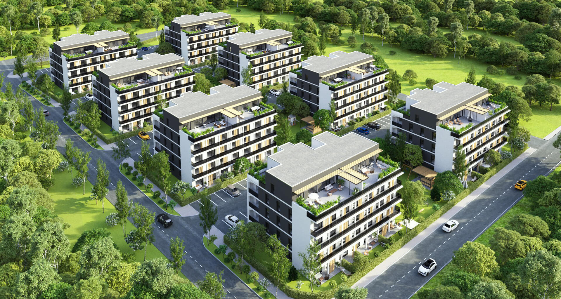
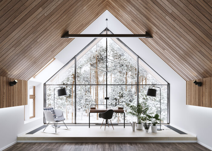
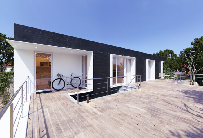
Blender 4.2: Precise Modeling Workshop
Learning Resources →

As you may have noticed, Blender 3D Architect has a new theme and a much cleaner layout. The old theme was online since the debut, about three years ago. I was looking for a new layout for a few months, and finally I found one that I like.

If you find anything wrong with the site, please let me know, because not everything is working on the new theme.

I would love to know what you think about the new theme, so did you like it? Share your impressions on the poll bellow:


So, I hope you like the new look and keep coming to find news and resources about the use of Blender for architectural visualization.

Previous

Free FBX converter tool

Next

Modeling a dresser for architectural visualization

21 comments

  1. It’s clean, but lack of some color and some image to be a graphic related website…
    It’s too black and white…

  2. its very nice but the lines of every post is smaller than before…for example i can not see the videos or see the all news i have to enter in every one to read more… excuse me for my bad english i am from argetina great site BTW

  3. The site has more features, like small thumbnails for every post. I will add more images with time, and convert the old posts.

    Thanks for the feedback! 🙂

  4. Hi Pablo,

    Don’t worry, with time I will make the proper adjustments to the layout to show full posts on the home page.

    Thanks for the feedback.

  5. WPEplorer’s templates are really nice with many options. I use one of them for my website 😉 This one is not my favorite but it is clean. Perhaps an other background could be better ?

    Bye

  6. I like this layout! Nice and clean!
    I think also you should put some images at homepage.
    Thanks for your work!

  7. Excellent! I liked much that clean design!
    Couple of observations (but most are very personnal):
    – force the color of the input boxes to black. since their background is forced to white, people with dark desktop themes like me are writing in white on white ;/
    – i think the background image could have more contrast with the white page, maybe play better with the dark grey elements (a dark gray + white image?)
    – i would use more of those cool clean icons like on the top bar… put them everywhere!

  8. Apart from some issues, it’s a great look.
    Also, thank you for maintaining this awesome website!

  9. There is to mutch advertising at the beginng of the page !
    Kick out the advertising.
    Im interested in News about Blender for Architecture and not into “Google – Advertising – Ads – Crap” 😉
    Please keep it as simple as possible, reduce to the max !

    The Layout is nice.

    Kind regards
    Alain

  10. Looks lovely. If the “categories” was a drop-down menu up under the title, it would be perfect. They’re kind of hidden at the bottom of that column over there.

  11. Old layout was better.
    Too much white space, even if it does have a subtle grid pattern.
    Last one was easier on the eyes.

  12. -Too much of white,
    – No prominent segregation for ads.
    – Blender3d architect Title doesnt stand out .
    – I still liked the older version.

  13. Great visibility, it’s fast to load, clean, well structured, white is not a problem, lack of graphics is not a problem, the content of the articles is the most important and is still same quality, it’s just better now, but yes it could be improved a little, for example the title, the contrast between the background and the doc’s body and maybe some colors, but i like this kind of clean classic theme like about 60% of the visitors, hope others will change their mind..

  14. Sorry Alan but I don’t like this theme at all…
    Home Page isn’t a true home page. In all other page types I have also the perception that content and navigation structure have no weight. I feel that I don’t know where to read.
    The only two things that I’ll save are typography (very nice) and the home page layout if only it was used as an article listing page (ie a category page).
    But the poll is by your side… so you’re right! 😀

    bye

Leave a Reply

This site uses Akismet to reduce spam. Learn how your comment data is processed.

Check Also

Clicky