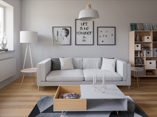
One of my favorite colors to work with interiors is white! Why? It might be because of the association with cleanses or simply because we are surrounded by urban spaces with a majority of gray shades. Have you ever found a clean white space in cityscapes these days?
Some people also love the new aspect of areas with a white color and often take that as a request for architects. By mixing white walls, furniture and objects with a beautiful wood floor will most likely put a smile on your clients face.
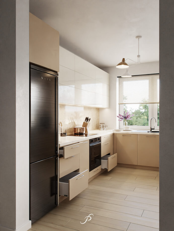
What about the visualization of such spaces? Here is an example of a living room the follows a similar guideline from artist ArcHWiZ. He had previous projects featured here in Blender 3D Architect. For this collection of beautiful images, we have an estimate of 5000-7000 samples per image.

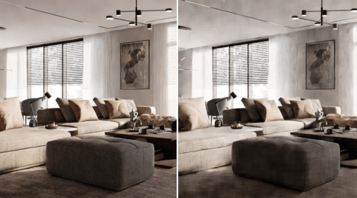
Unfortunately no information about the render time for each image. The downside of working with so many white surfaces is the amount of noise it might generate. Notice that an average of 6000 samples is much higher than we usually find in architectural visualization projects.
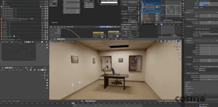
And even if an incredible artwork wouldn't be enough you can still learn something from this project. The artist posted in the same thread all settings for his HDRI map. For those unfamiliar with how Blender Cycles works, an HDRI map is one of the key components for light distribution.
In architectural visualization related to interiors, it is almost a “rule” to use good maps as a world texture. If you are getting started with Cycles, the settings might give you a direction to follow. And for people that already have their hands in Cycles, it will serve as a comparison case.
For settings such as background textures, you will probably need to make adjustments. A lot of factors will impact the way light works in a scene, like the scale of the project.


Nice work, he posted more settings and rendertimes on blenderartist.