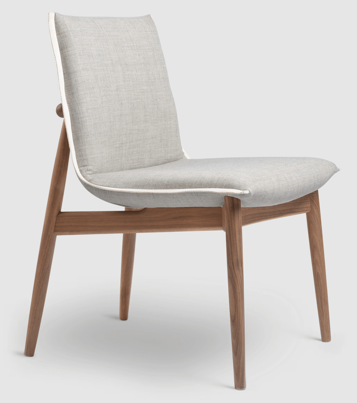
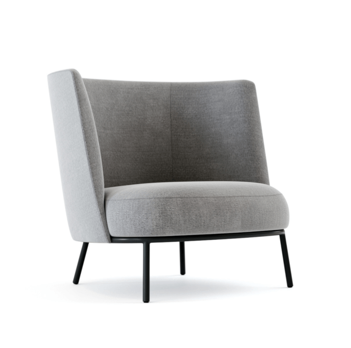
What would be of an architectural visualization project without some great furniture models? Well, just a bunch of walls and planes, but not real felling of humanity in the environment, and the lack of scale to the project. That's why we must always place some furniture models into our projects. Sometimes these models aren`t available to download, or you simply want to model your own pieces of furniture. Today I will show how to start the modeling of a classic piece of furniture in Blender, the Barcelona Chair from Mies van der Rohe. The design is from 1929, but even today this chair looks really great in modern interiors.
If you want to create an architectural visualization project in Blender, and want to use this chair, let me show you how to start modeling the seat of the chair. In another article we will finish up the rest of the model.
The shape of the chair is the biggest challenge, with those cushions and stitched leather.
Let`s get started!
The first thing to do is to create a plane and subdivide it 4 times, or if you prefer just use the subdivide multi option.
Change the select mode to face (CTRL+TAB), and with the central face selected turn on proportional editing (O key), and setup the proportional type to Roof. Move the selected face a bit up, and with the proportional turned on, the surrounding faces will be moved as well.
The next step is to apply two Array modifiers to the plane. You have to make four copies in one axis and five in the other one, the order of the axis is not important.
After the arrays, hit apply in for both modifiers. This will turn the copies into real objects.
Now, this is extremely important! Enter in Edit mode, select all the objects and with the Specials menu (W Key), choose the Remove doubles option. If you skip this step, the resulting model will be all messed up by the next task.
While you still have all objects selected, extrude them down a bit in the Z Axis. By the end we will have a model like the one showed in the image below:
Since the bottom of the seat is flat, we will have to use the Scale transformation to flat all faces. With faces selected, press the S key to scale, and the Z key to restrict the scale to the Z axis. And finish up the scale pressing the 0 key from the alphanumeric keyboard.
The result will be a flat set of faces, for the bottom of the seat:
Now, select the faces pointed in the image below and erase them.
In the previous step, a group of four faces as left off the selection. Well, select these faces now and duplicate them to a place near the model. After you duplicate it, erase the original four faces, to leave a final hole to the mesh.
Select only the central vertex of the copied faces and erase it. The result will be a square, with eight surrounding vertices, connected by lines.
With the eight vertices of the square selected, align it with the 3d cursor using the Snap tools (SHIFT+S). And create a mesh circle with eight sides. If it`s necessary make the proper adjustments to the scale of the circle, until it fits inside the square.
Now, select groups of four vertices and press the F key to create faces.
Use the extrude and scale tools to create a structure similar to what is showed below.
A shortcut that can really help at this point is the selection of loops. Just hold down the ALT key and right click on any edge and an edge loop will be selected.
If you want to get an idea of how the modeling is going so far, apply a subsurf modifier to see the smoothed surfaces.
For this next step, we will hide the lower vertices of the model. Select them and with the specials menu, choose the Hide option. Since we will be using some of the top vertices of the model, it`s wise to only leave them turned on.
Let`s use an incredible new feature of Blender, to help us with the duplication and placing of the buttons. Select all the vertices of the model, and turn on the new snap tool by hitting the small magnet icon in the 3d view header.
Now, press the SHIFT+D keys to duplicate the object and hold the CTRL key while you move them. When you get close to one of the holes in the mesh, a small white circle will appear. You can drop the copied objects in the best position marked by the white circle.
Repeat the process to place the other buttons to fill all the remaining ten holes in the mesh. Don`t forget to erase the button mesh outside of the seat.
Use the specials menu to make the whole mesh appears, just choose the reveal option. We have to add a few extra loops to the model, to be more precisely, another five cuts.
Use the scale tool to adjust the size of the new loops, and make them look like the image below. This is important to create the crease in the side of the seat.
It`s almost done, the only thing missing here is the creases between the cushions. Here we have two options to create these creases, which are:
- Poly modeling
- Use the sculpt tools in Blender
I have saw a few skilled artists using the sculpt tools for that, but I rather prefer the poly modeling. If you think the result will be better with sculpt, feel free to try.
To work with the poly modeling tools here, we will need a bit of patience. The first task will be the selections of the edges that delimit all cushions. Just select the edges in top view, and remove the edges from the buttons later.
With the edges selected, press the W key and choose the Bevel tool from the specials menu. We will only need a small bevel.
Change the selection mode de face, and extrude the selected faces just a bit, twice.
Here is how our model is looking so far:
If you want to control the bending of the model, just use a Lattice to make all the desired adjustments to the seat.
Well, that's it for now. I hope you get the idea of how to model the seat of a Barcelona chair in Blender 3d. This is a classic furniture model, which fits quite well in most projects. This is not the only way to model the object, but with the process in mind, feel free to make your own adjustments.
In another article we will model the rest of the chair.
I bought your book. You rock! Thanks for this tutorial.
Sweet! I received this via e-mail and went through the tutorial. Very nice. Perhaps going over the details a little more would be useful.
I may design it again once the rest of the tutorial comes out, because I made some mistakes designing it the first time, such as making it 5×5 instead of 4×5, and I could make the buttons bigger along the xy axis.
But all in all, very helpful and useful. Bravo! More, more! ;D
Banor
http://minosafilms.wordpress.com/
Very useful!
Thanks a lot
Thank you for this tutorial. On the line of your book.
Thanks Allan! Great tutorial! I appreciate the work you put into this web site. I am always trying to learn better ways to model.
Thanks again,
Jerry
Haha… I found this on Google, did the whole tutorial and then found out WHOSE blog this is. I bought your “Architecture, Buildings and Scenery” book! Great! Now you’ll have a permanent guest here 🙂 THANKS!
Best Article.
Thanks for sharing.